

Wizkid’s long-awaited mixtape/EP Sounds From The Other Side is just over a week away from being released and expectation is rising. The project is Wizzy’s major label debut and follows up 2014’s Ayo album, which was released locally via Empire Mates Entertainment.
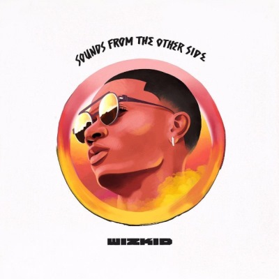
Wizkid unveiled the cover art for the project yesterday and the feedback has been overwhelmingly negative – so negative, that the singer had to clown the cover himself.
https://twitter.com/wizkidayo/status/880127819027591168
But all that is okay, appreciation for art is entirely subjective. A piece of art is meant to make you feel something, anything, but it shouldn’t be indifference.
That said, it’s not hard to see why the internet has reacted so poorly to the minimalist design for the SFOS cover but for those still sitting on the fence or those who don’t even know what the fuss is about, here are 3 reasons why Wizkid might have given us the worst cover art since CDQ decided to kill a white ram for Sallah and wear its skin across his shoulder last year.
1. The Cover Art Has Nothing To Do With The Title
Wizkid is in a unique position as a Trans-Atlantic connector for African music and even though SFOS has been in the oven for a while, it couldn’t have been released at a better time. The world is ready for our unique pop sound, the biggest song released last year, Drake’s “One Dance”, had Yoruba in its lyrics, while several songs released this year have copycatted its sonic template. Wizkid’s own single “Come Closer” has charted in at least 6 different countries worldwide and helped to build anticipation for Sounds From The Other Side.
The project’s title is poignant and compelling, and Wizkid’s explanation for it, even more so. According to the Nigerian pop star:
I’m trying to fuse the sounds from artists out here [the US] with my local producers back home, and international producers as well to do something special – like a little playlist for summertime.
With such a powerful title, and being released at such an opportune time, the one thing that would have made this moment even more impactful is an equally powerful cover art – cover art that embodied the sights of the other side that Wizkid is singing about, while the music captured the sounds.
2. Wizkid’s Art Direction Has Regressed
2 steps forward, 1 step backward: as Wizkid progresses in his career, the hope is that he continues to improve every aspect of his artistry, including presentation. To be fair to him, he actually has. The cover art for his projects have shown his evolution, from being casual and playful on his debut, Superstar, courtesy of graphic artist Osa Seven, to being mature and steeped in culture on the Ayo album.

But those artworks also embodied the music on the albums. When you saw the Starboy album cover, you instantly understood that Wizkid was being targeted at a young audience, when you saw the Ayo album cover, you see he’s coming of age and embracing his roots. Tell me, what do you see when you look at the cover for SFOS?
The lack of direction is even more shocking because the cover art for some of Wizkid’s recent singles have all been top notch, even his pictures on social media have been extra crisp and carefully curated. Wizkid and his team seem to understand that the gifted pop star could sing 1,000 songs and they’ll all blow but a picture is worth more than a 1,000 words in all of those songs. The cover art for SFOS therefore feels like they momentarily forgot the importance of the great art they had already started to make.
3. The Cover Art Isn’t Memorable
Since yesterday, I’ve been thinking to myself, if I didn’t know who Wizkid was from a can of paint and a CD hawker stuck his new EP in my window in traffic, will I be curious enough to wind down, buy the EP and then put it in my CD player? Now, carry the same logic to the thousands of people who Wizkid wants to introduce his music to for the first time next week, does the EP cover present a good enough impression for them to go listen if it creeps up randomly on their Spotify or Apple Music playlist? Wizkid is trying to penetrate into new markets and cannot rely on name recognition alone to gain more listeners – he doesn’t have that luxury.
Also, recall last year when Weeknd, titled his last album Starboy and every Nigerian with access to the internet cried foul. That moment has come and gone and our Starboy’s star hasn’t lost its shine but there are obvious opportunities for branding and identity management that the singer is still missing out on. For instance, Wizkid’s Starboy entity may have an easily recognizable logo and strong brand identity but Wizkid, as a separate but related entity, still doesn’t. Without the opportunity to include the Starboy logo on his major label releases, a logo for Wizkid himself seemed like the next best thing but, curiously, that is yet to happen.
Davido has maintained some elements in his cover art that makes his covers visually recognizable
Cover artwork gives artists a unique opportunity to project a particular style, image, or brand that fits their music or their own identity. If there’s something Wizkid can learn from his arc nemesis Davido, it’s that subtle objects like unique trademark fonts, colors, and designs work on people’s psyche and helps them remember you and immediately distinguish your work amongst all the others. That way, it’s not only the music that has to speak for you.